Sunday, April 30, 2017

Final-Museum Trip

Quinn Niego
April 30, 2017
2DS17

The first piece is my masterpiece from the art museum. The foreground wall is made of clean and mechanical lines. The middle ground is unsaturated and more organic because it is of nature (specifically trees). However, in the middle ground there is also a highly saturated and vivid circle that is suppose to represent the moon or sun I'm guessing. This is the focal point of the whole piece. The background (sky) is highly saturated and vivid and goes along well with the circle. This piece was eye catching, unique, and used saturation well. Therefore, it is my masterpiece from the tour.

The second piece is my disaster piece from the tour. It is all unsaturated and nothing stands out. The lines are blurry and undefined. The hues used are also fairly random and don't go well together. There is no part of this piece that is eye catching and it all seems to blur together. Every time I look at this piece I want to look away. The blurriness, random hues, and lack of any focal points make this piece my disaster piece. 


Final Project

Quinn Niego
April 30, 2017
2DS17

Here are my three final pieces that are war themed. Each piece itself is associated with war and they all are sequenced together as well. In the first piece their is a soldier firing a rock launcher. In the next piece, the soldier is on the ground (implying death). In the third piece, the soldier is gone and all that remains is the helmet. Another theme I tied in was the economic advantages that go along with war. This is shown by the dollar signs that represent the smoke coming from the rocket launcher.

I used my photo as the the background. I used Photoshop to make it unsaturated and blurry to let the soldier and other aspects stand out.  The solder, rocket launder, and helmet were made using Illustrator and the cutting machine. They are the focus of the piece (specifically the soldier) and are therefore larger and in the foreground. I used a dark hue (black) for the soldier because it stands out the most against the unsaturated background. I used an olive green for the rest because it is often used for camouflage and also does not pop as much as black does.


Week 15- Photoshop (final project)

Quinn Niego
April 30, 2017
2DS17

Here is my edited Photoshop document for the final project. It was originally a photo of a golf corse and I used photoshop to make it look more like a battle field. I lowered the saturation and created some blur to make the photo seem more distant and to let the soldier and rocket launcher in the foreground stand out. I pixelated and blurred the path to make it look like a dirt road too. The gloomy blur an lack of saturation allows other parts of this piece to stand out while incorporating a photo that looks more like a battlefield after I edited it with Photoshop.


Monday, April 17, 2017

Week 14- Photo and Illustrator (final project)

Quinn Niego
April 17, 2017
2DS17

Here is my photo and rough draft Illustrator pieces. I plan to make the paved road a dirt road by using Photoshop. I also plan to take out the saturation of the background and make it slightly blurred. I also plan to use the Illustrator pieces to make the cutouts that will be the focal point of my three final pieces. I will use a greenish hue for everything besides the soldier who will be a black hue that is meant to stand out the most.


Wednesday, April 12, 2017

Week 13- Sketch for Final Project

Quinn Niego
April 12, 2017
2DS17


For my final project I designed some sketches based off of a photo. I plan to use a photo of my own as the background/landscape. The soldier figure and missal launcher will be incorporated using Illustrator and the cutting machine. I will add any text and details using Photoshop. My details will be saturated and vivid. I plan to make the themes of death and money stand out through this method. I will likely used rather dull hues throughout the rest of the work to allow other aspects to stand out.


Thursday, March 30, 2017

Week 12- Stencil Revision and New Stencil (pattern)

Quinn Niego
March 30, 2017
2DS17

This weeks assignment was to revise last weeks stencil and to make a new one with a pattern included. We had to either make a perfect two color stencil with a positive and a negative or a three colored one. I decided that my design would be too difficult to make into a perfect two color stencil so I decided to make a three color stencil. The first piece below is my revised design in illustrator. I added headphones to take up more space and added in cracks on the screen to make the piece more interesting and break up the flawless nature of the iPhone.

The second piece is my revision form the suggestions that were made in class. I chose to change the color scheme to something a little more unorthodox. Apple is mostly sleek and controlled so I decided to use hues that were a little bit more off colored and vivid. This contradicts an iPhone and goes along with the crack in the screen that was part of my design. The screen is eye catching because of the detailed design of the crack, but the saturated orange hue also gives the viewer something to look at.

The third piece is my piece that uses patterned paper. I liked the way that the dark brown hue went with the pattern, but wanted the pattern to have its part too. Therefore, I made the pattern the background. It takes up the most space and the brown hue compliments it well, while also standing out because it it the darkest part of the piece. The light purple is subtle but is involved with the more detailed parts of the piece. Therefore, it also makes its way into the spotlight and enhances the design.


Sunday, March 26, 2017

Week 11- 2 Perfect Stencils

Quinn Niego
March 26, 2017
2DS17


For this assignment I chose to make two perfect stencils, which means that all the white touches in the Illustrator file (the first piece below). From there I actually physically created the two stencils using Silhouette and the cameo machine. I chose to use an extremely light blue and a darker red to create my first stencil. In the second piece, I used the same light blue as the first piece, but used a more saturated blue for the second color. One can see the light blue clearly up against the red. However, the light blue looks almost white in the piece where both colors are blue. Even if they are placed side by side the light blue looks like a different color in the two pieces. In the first piece, the red is more eye catching than the light blue. The second piece is more difficult to pin down because the light blue has more details, but the other blue is more saturated.


Monday, March 20, 2017

Week 10- Stencil (In Class)

Quinn Niego
March 20, 2017
2DS17

The first piece is the illustration stencil that I created for class this week. The second piece is the actual stencil that I created in class using silhouette and the cutting machine. The first piece is crisp and pleasing to look at. The second piece has a brighter hue present and is eye catching. This also makes the details noticeable, such as the writing on the ball and the lines, even though they are not a a highly saturated hue like the orange around it.


Sunday, March 19, 2017

Week 10- Stencil

Quinn Niego
March 19, 2017
2DS17

For my stencil I chose to do a basketball. The design is simple, but the curves and writing made it somewhat challenging to create an accurate representation. I made sure that all the white parts are touching so that it is actually a stencil. This illustration was mainly made using the pen tool to make lines on the black dot that I placed down first to create the basketball itself.


Monday, March 13, 2017

Week 9- Illustrator (In Class)

Quinn Niego
March 13, 2017
2DS17

This is a piece I did in class when we were learning to use Illustrator. I used my photo to create various layers to roughly outline the main layers of the actual photo. I also used the eye dropper tool to make sure that the hues were the exact same as the photo for each given layer. I started in the background and moved to the foreground so that the objects that are closer overlap the ones that are further away and give the viewer some way to figure out where the objects are in relation to one another.


Week 9- Space Photos

Quinn Niego
March 13, 2017
2DS17


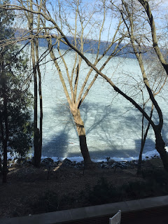
These 5 photos are of outdoor "space." I tried to get pictures that are different and have depth to them. Each picture has some sort of foreground, middle ground, and background. Most of the photos involve trees and this helps one determine where each object is located. In the first picture the tree is large and in the foreground, while in the last picture trees make up parts of the middle ground and background. The size, detail, and shadowing of objects in photos helps one place objects were they actually are located.


These 5 photos of indoor "space" all have attributes that show depth to the viewer. In the first photo the lights on the side become less and less detailed and blur together. In the third photo the lines appear to get closer together as they get further away in the photo. However, one knows that the lines stay the same length apart. In the last photo the railing supporters appear to getting closer together too, but one knows that they are the same length apart. One can tell from these photos that less detail and less space between objects means that they are further away in the photo. These characteristics help one determine the foreground, middle ground, and background of each photo and were objects are located.


Sunday, March 12, 2017

Midterm- Gallery


Quinn Niego
March 12, 2017
2DS17


I visited Barbara Cooper's art gallery at Saint Xavier for my midterm assignment. The gallery consisted of her sculptures and a couple of her drawings. I chose the two sculptures above for this assignment. The first one is called "whorl" and the second one is called "link."

Barbara Cooper is known for using nature as a motivation to create art. She is fascinated by natural phenomena and the fluidity of natural designs and sculptures. She showed several natural photos that explained where she finds inspiration for creating her sculptures. She pointed out that nature is extremely detailed and she like to use its flow and unique patterns to create interesting pieces of representational art.

The first piece, "whorl," is named after the circular spirals that it implies. It is a relatively simple piece that can represent many natural occurrences. This sculpture is organic, but does have some direction to it if one looks at the flowing curve that is present. The whole piece is made out of the same type of wood that has been pieced together to create a curved whorl.

The second piece , "link," is named after the link that it creates towards the top. The top is a different material than the rest of the piece. This drags ones attention to the "link" that is created. This piece appears mostly organic, but not as organic as "whorl." This is because a complete circle is formed in the middle and the curves appear to be more pre determined.

Both pieces are inspired by nature and this is shown in their flowing and organic designs as well as the materials that were used to create them. They both have curves and overlapping pieces that together form the piece as a whole. They are both simple shapes, but also detailed because numerous wood pieces were used to compose each of them. I would say that "whorl" appears to be more abstractly created because of its simplicity and the variety of interpretations that the design can represent. On the other hand, "Link," seems more straightforward because it has a clearer shape and representation. Both pieces are unique and are structured carefully so that they do not look structured. Nature is organic and this is what Cooper relays to us through her art, specifically these two pieces.  

Sunday, February 26, 2017

Week 8- Photoshop (frame and text)

Quinn Niego
February 26, 2017
2DS17


For these three Photoshop pieces I used a subtle main hue combination (red and blue) to create "pop" images that include a frame cutout and text. Red and blue are just about tertiary colors, which means that they create a more subtle combination than complimentary hues. The solid red layer is not excessively saturated which makes is somewhat dull. The blue pop hue does create focal points, but they are as noticeable as last weeks assignment because the blue has a darker value level. I used a generic blue to create the frame cutout to show variation in the blue hue, but to maintain a subtle approach. I created a little more pop by using red text that has a lighter value and higher saturation level. All these factors make these pieces unexpected and interesting.


Monday, February 20, 2017

Week 7- Photoshop


Quinn Niego
February 20, 2017
2DS17


These first three pieces are different versions the of 1 photo that use different points of focus. The solid color is blue and the "pop" color is orange. These hues are complimentary which gives them even more of a pop. I did a "super pop" in the third piece by adding in some white so that the pop area stands out even more.


These three pieces are three different pictures that focus on one thing. I used hues that are either complimentary, or close to it, to create extra pop. In the last piece the focus (the water bottle) even has different levels of focus within it. The lid area pops the most and the water creates different values throughout.


For my transformation piece I chose to do a frozen pizza before, during, and after being cooked. I usually complimentary and tertiary hues compared to the solid background color (green). Red is complimentary and yellow is tertiary to green. This shows that pop is created by hue as well as saturation. 


Monday, February 13, 2017

Week 6- Lighting Pictures


Quinn Niego
February 13, 2017
2DS17


For my photos I used control of lighting to create various shades throughout each piece. This allows each photo to have various saturation and value level possibilities. These levels will be more prominent when they are changed to black and white. The lighter spots on each picture will make good areas to create "pop" when they are edited using Photoshop. The shading should also create various saturation levels (from dull to vivid) within the main solid hue that will be used. To start that hue will be black and white. Controlled lighting allows one to create several variations while using similar hues that make each piece unique and eye catching. 
.